Logo Design
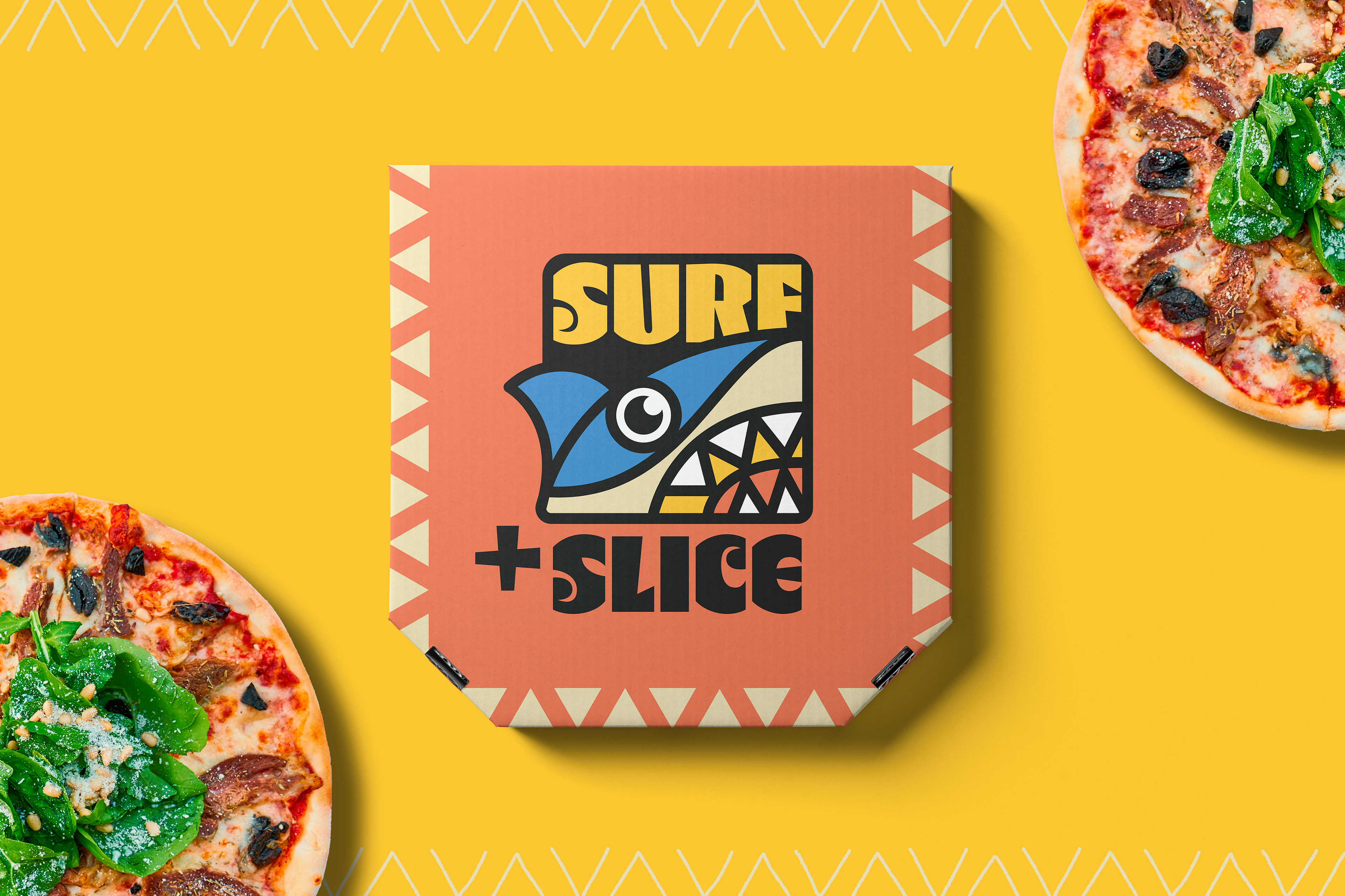
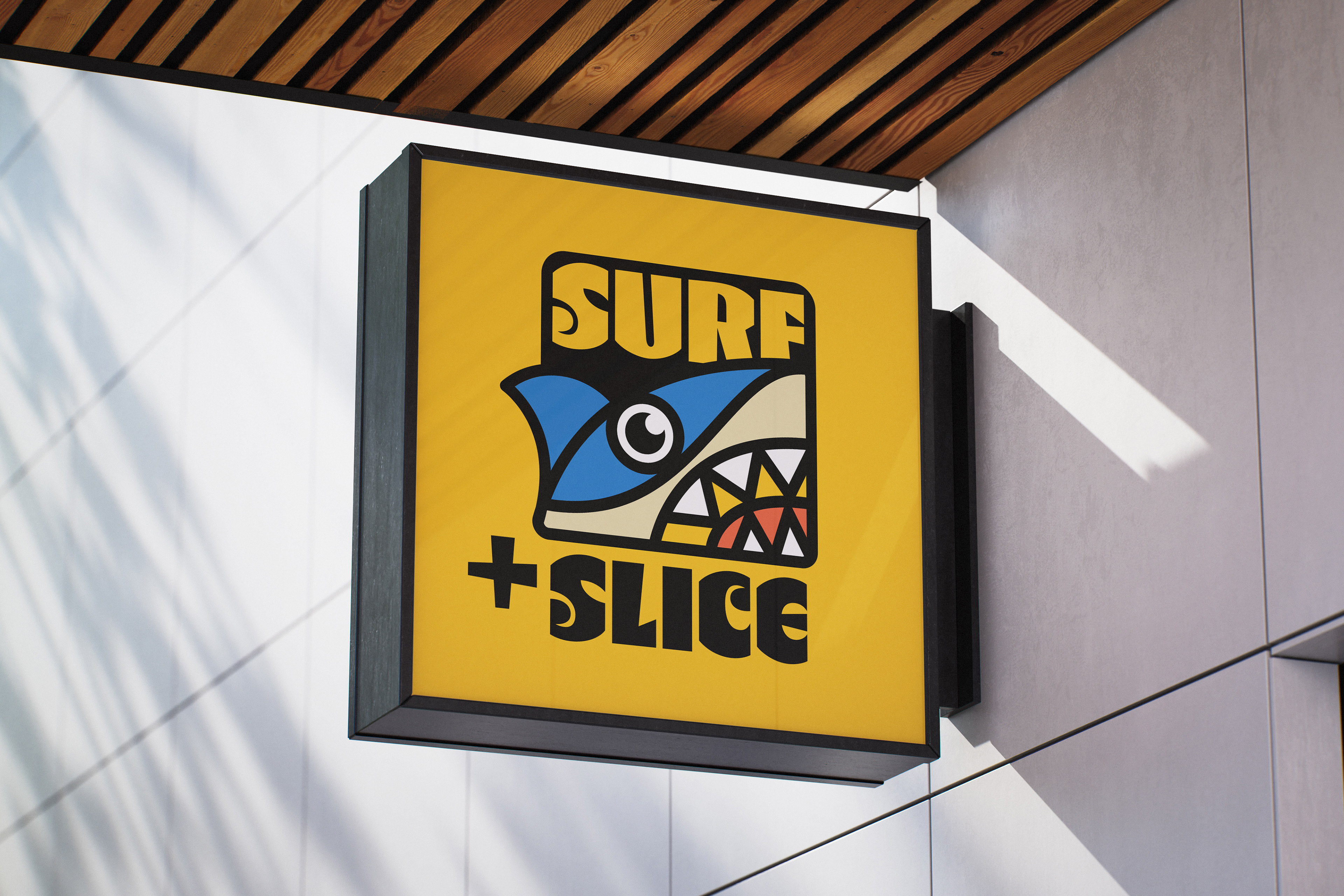
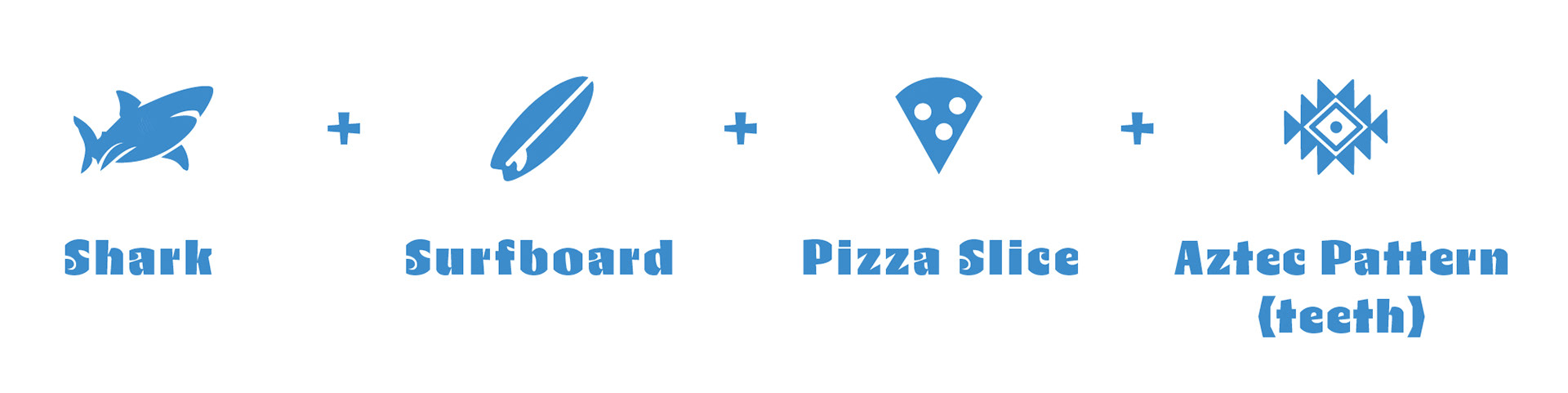
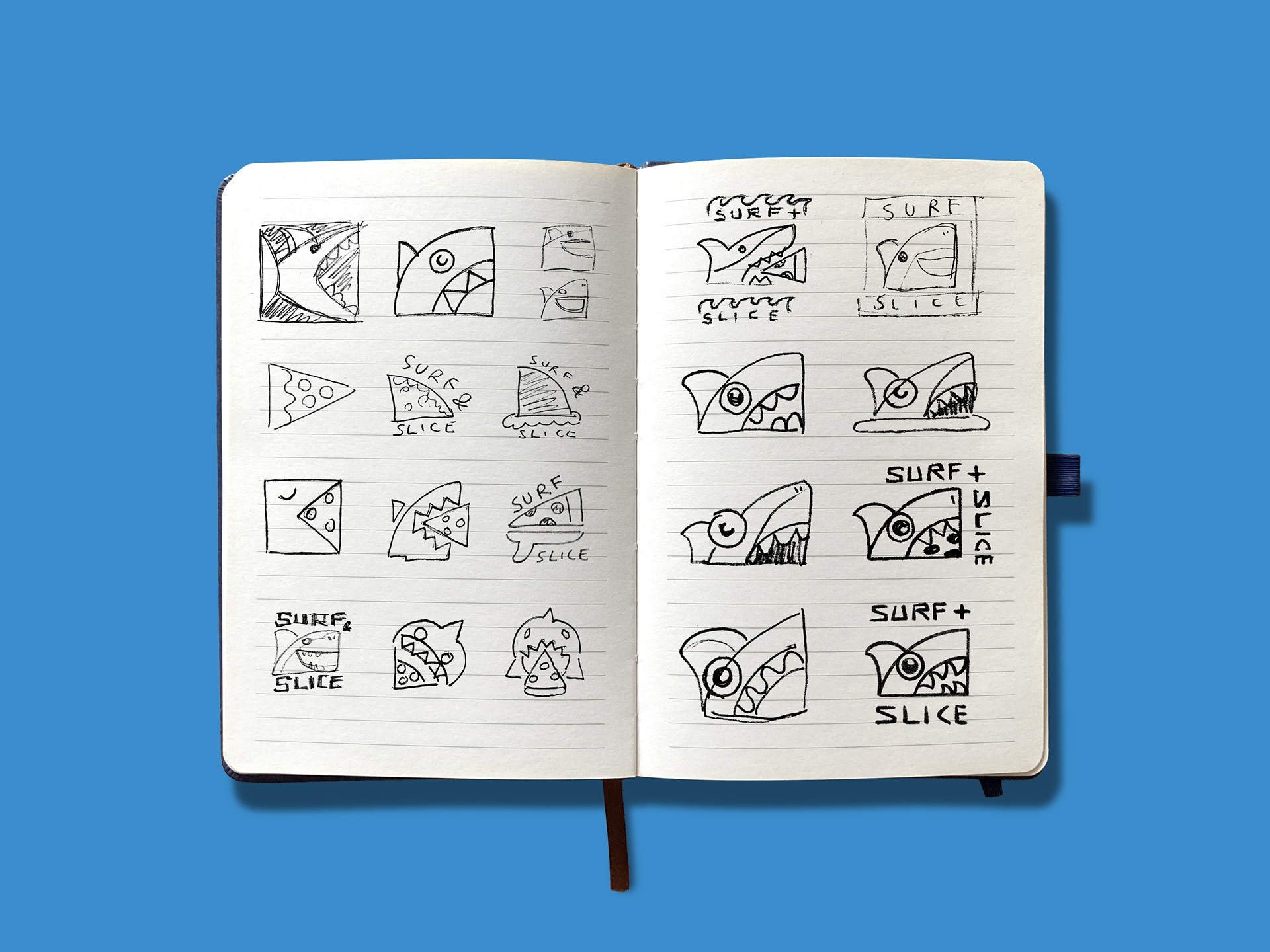
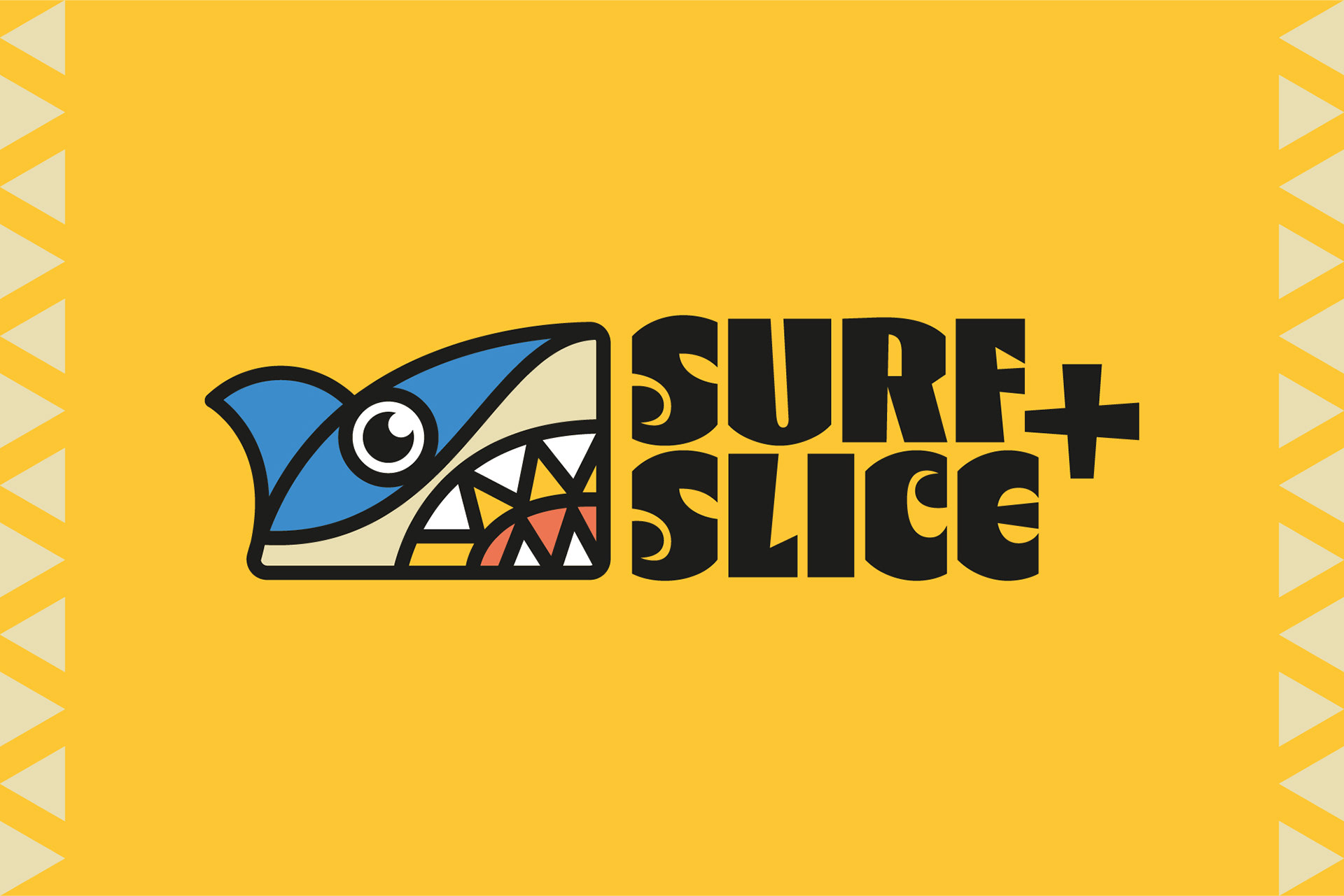
The shark logo was developed by merging four core visual elements, A shark, surfboard, pizza slice, and Aztec-inspired pattern. This creates a character that feels both unique and instantly recognisable. The Aztec motif was incorporated into the teeth, adding cultural depth and visual interest to the design. The wordmark was carefully selected for its bold, blocky letterforms, which carry a carved sculptural quality that reinforces the brand’s distinct personality.
Colour Palette
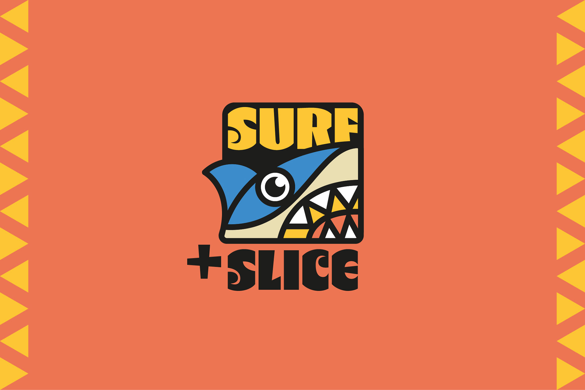
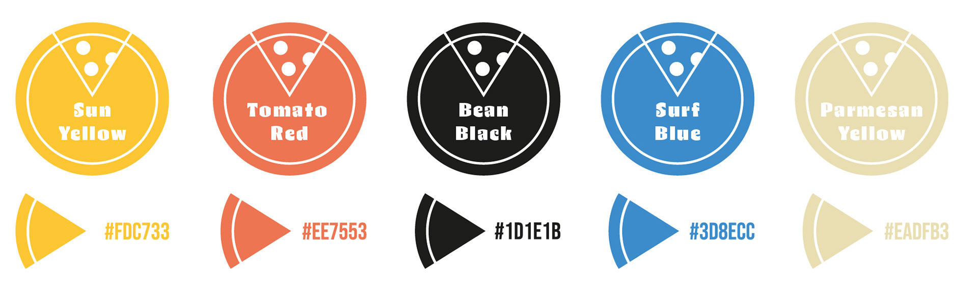
The identity of the brand was brought to life through a warm colour palette. Drawing inspiration from the energetic, sun-soaked atmosphere of beach culture. The vibrant, bold tones reflect the lively coastal setting while also nodding to the passionate culinary traditions of both Mexican and Italian cuisine.
Menu, Packaging & Merchandise
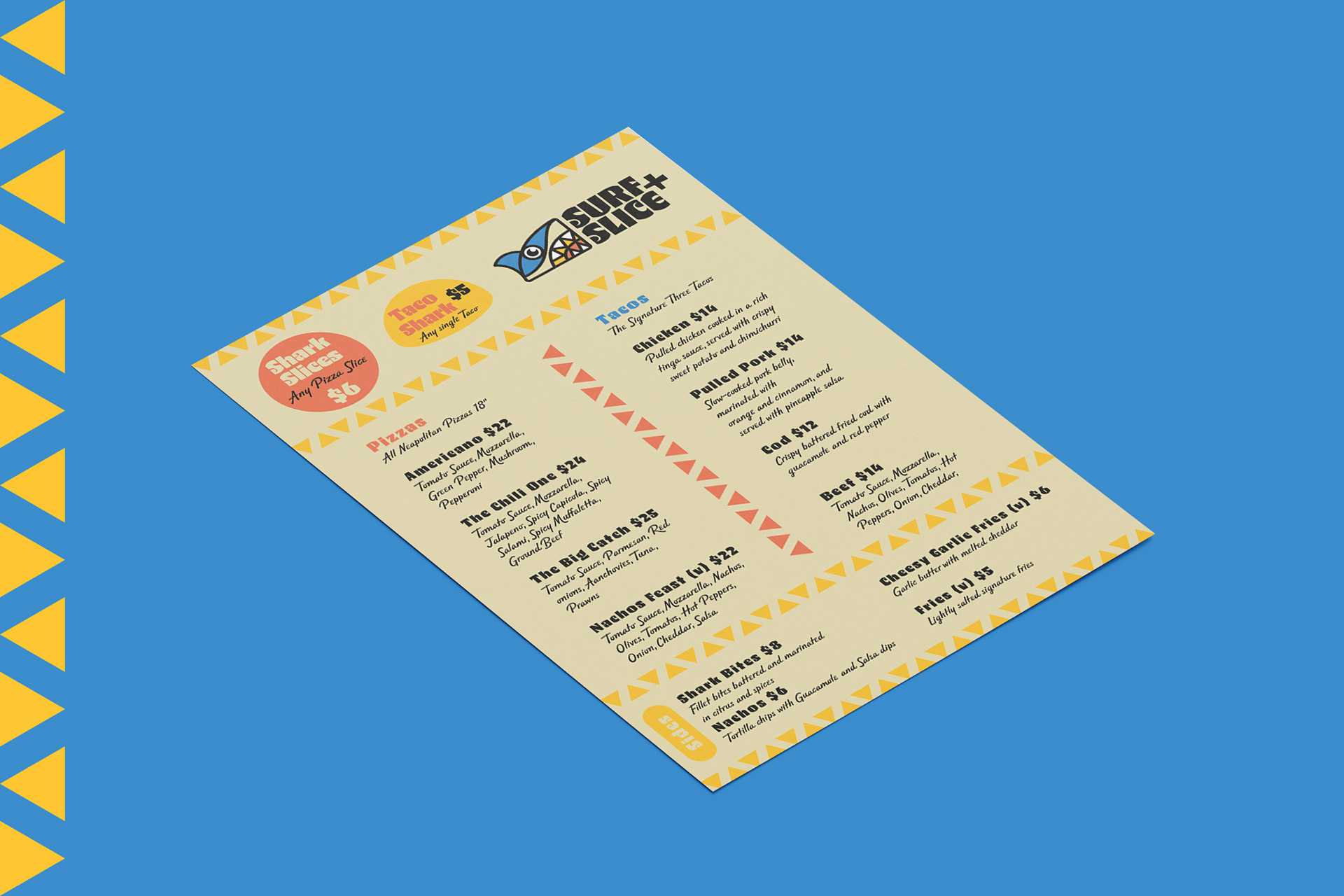
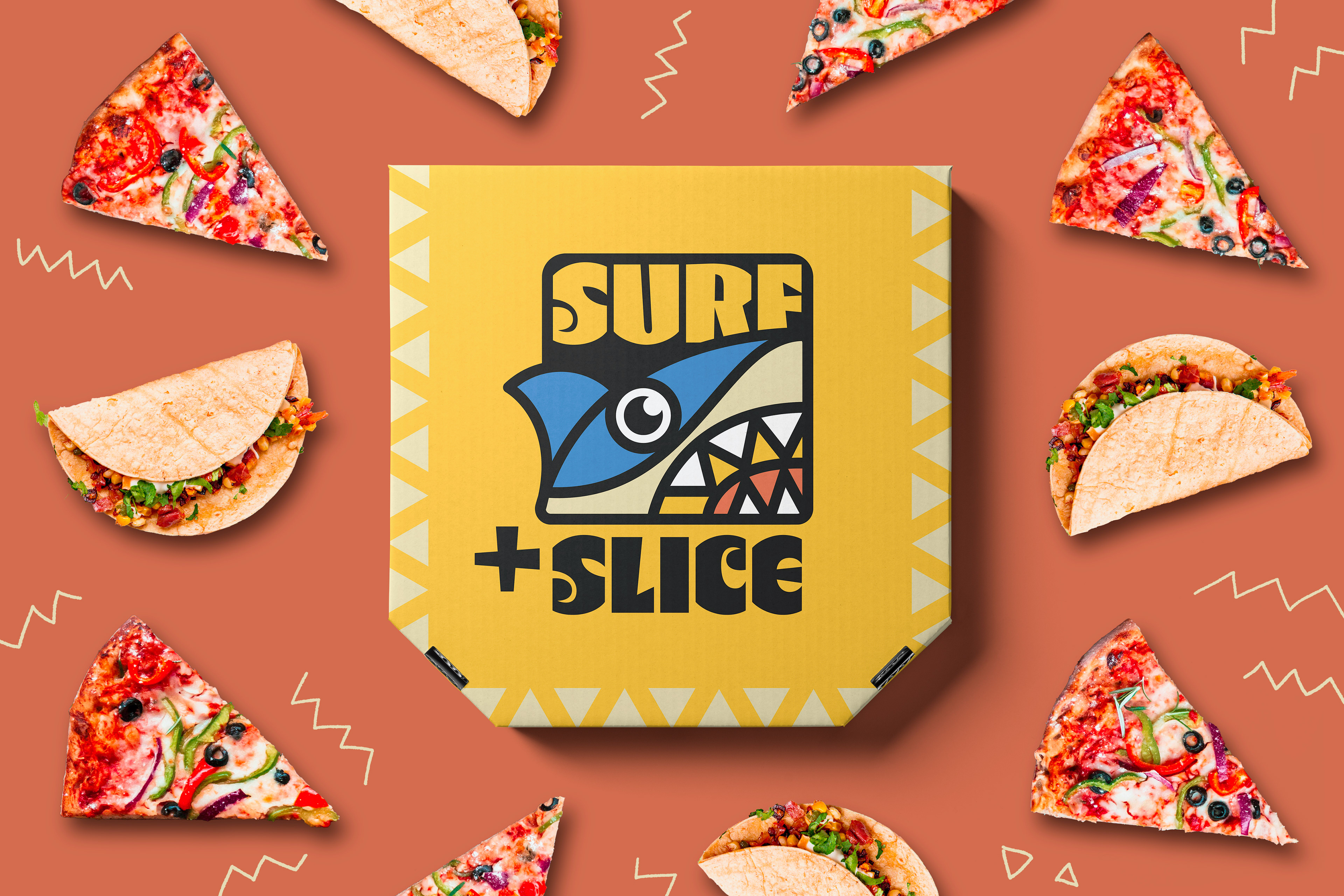
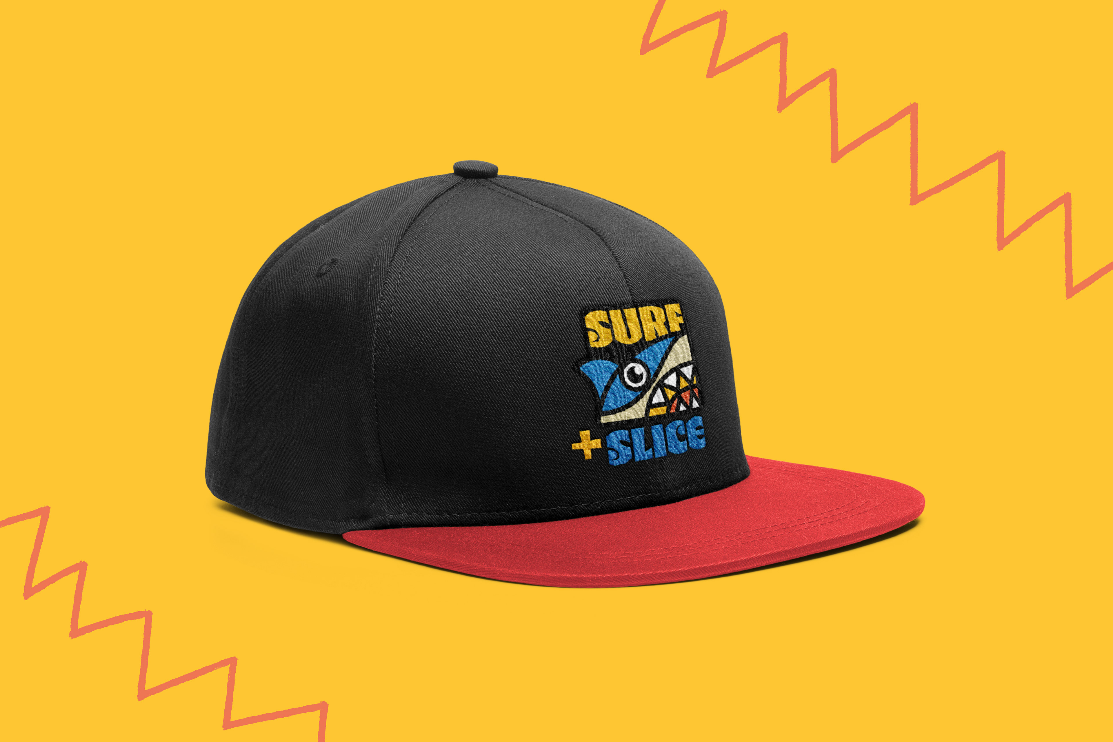
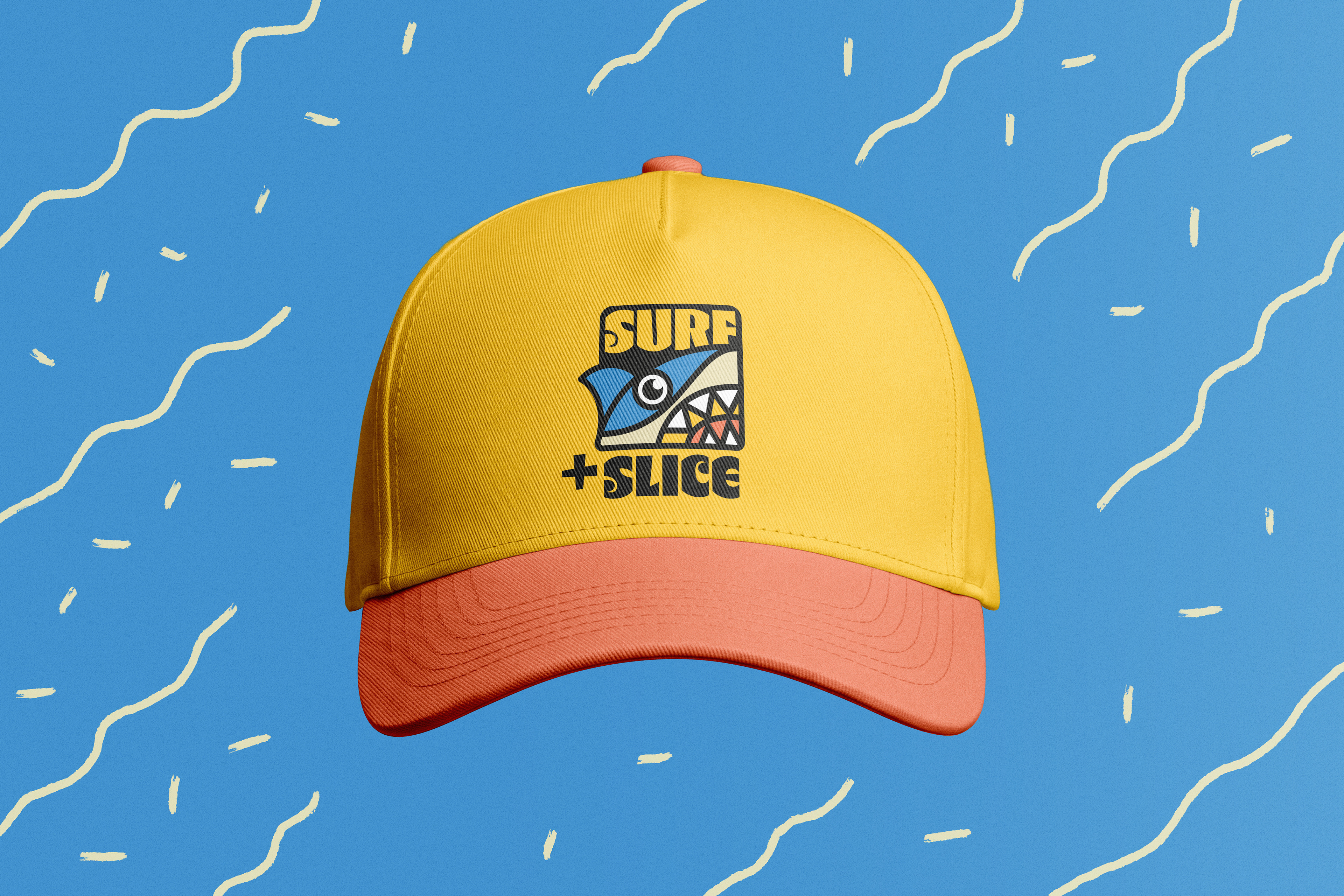
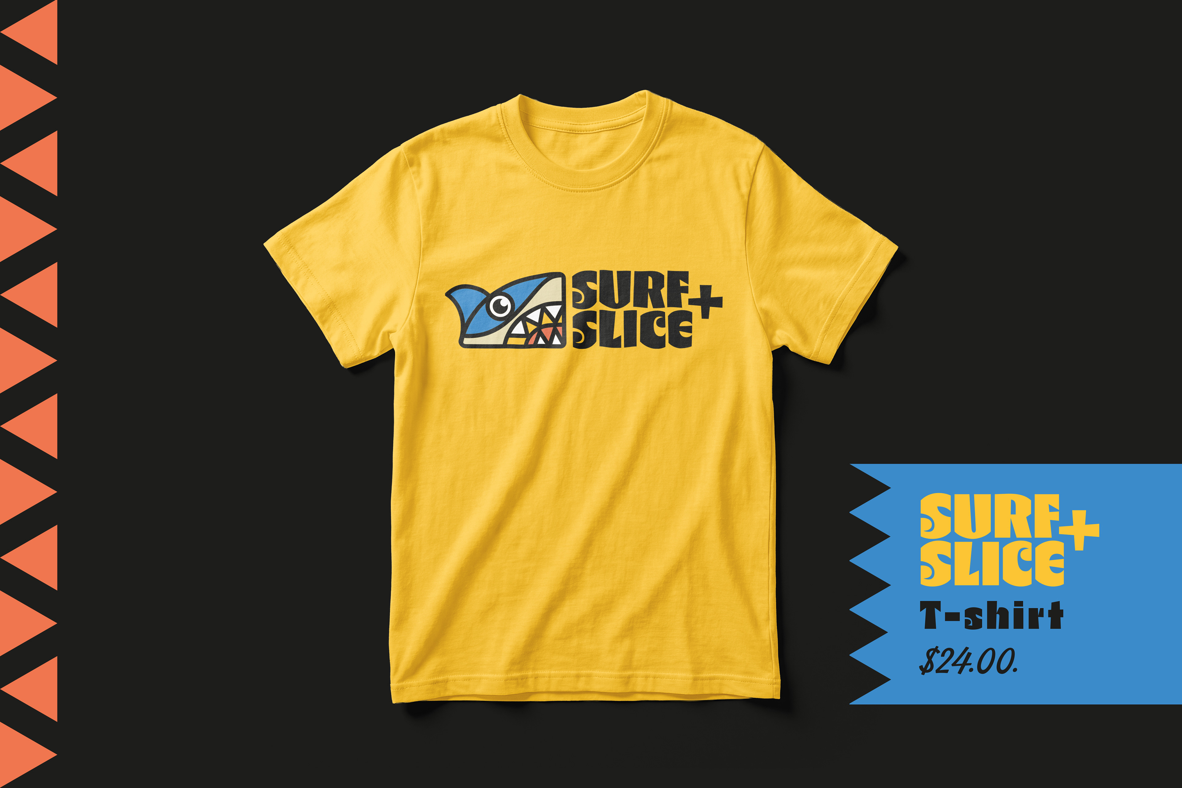
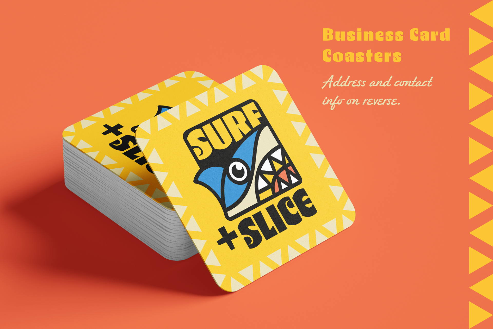
Every touchpoint was carefully considered to ensure a cohesive brand experience. The goal was to ensure that whether a customer is holding a box, wearing a t-shirt, or simply walking past the space, the brand is immediately recognisable and communicates the fun, vibrant energy that defines it.